
A modern site for the anglers' booking platform.
Guidesly connects anglers with local fishing guides. The idea was strong; the site had aged past it. We rebuilt it into a clean, secure, mobile-first experience that gets out of the way of the booking.
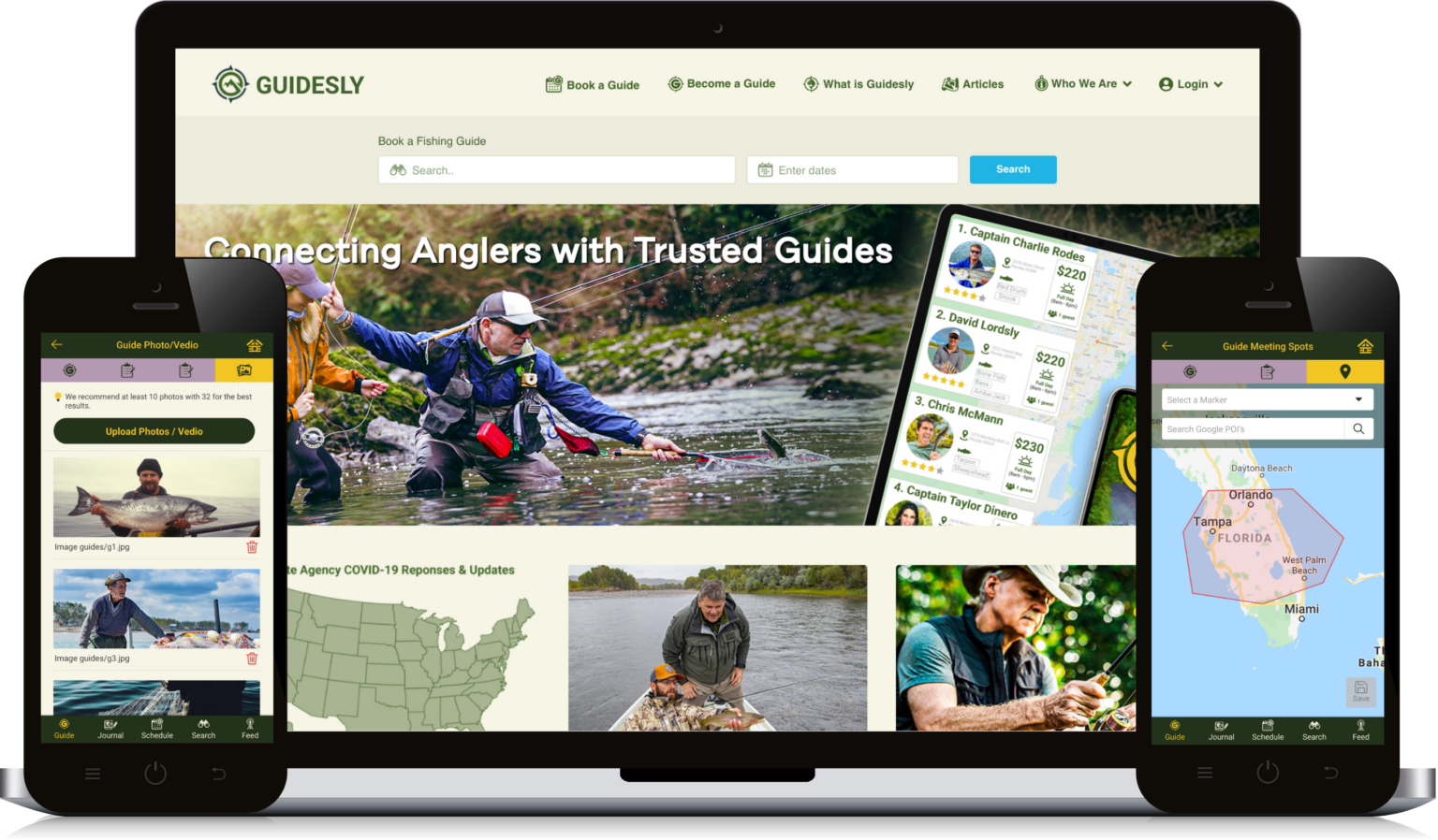
A great idea, on a site that had aged past it.
Guidesly connects anglers with local fishing guides, a genuinely good idea that deserved a website to match. The existing site worked, but it looked dated. The palette felt tired, the navigation was not intuitive, and the moments that mattered most, payments, reviews, and location services, needed to feel more secure and dependable for people trusting the platform with real bookings.
The brief was not a fresh coat of paint. It was a site that could carry the weight of real money changing hands, out on the water, on a phone, first time every time.
We started by listening.
Before touching the design, we sat down with Guidesly to understand what made the platform valuable in the first place: not just what the site looked like, but what it needed to do for anglers and guides alike.
From there we ran a full content audit of the live site. That gave us a clear roadmap of what to fix, what to keep, and what to elevate, so the redesign was driven by how the platform actually gets used, not by taste alone.
Three things we prioritised.
Guidesly's mobile app is a big part of the experience, so we gave it the visibility it deserved on the new site.
We stripped out the clutter so booking a guide feels quick and obvious, not like a chore.
A more refined colour scheme gives the site a sharper, more trustworthy look, worth handing your payment details to.
Everything the platform needed to do.
Bookings and payments protected by modern frameworks, so trust is the default.
Tailored fishing suggestions that make the experience feel built for each user.
The right guides, in the right waters, wherever the angler is.
Real feedback from real trips, so guides earn their reputation.
A simpler, more intuitive path from browsing to a confirmed guide.
Safety features baked into the experience, not bolted on after.
Less time scrolling, more time on the water.
The result is a clean, modern interface where users spend less time scrolling and more time finding what they need. Anglers and guides now move through the site without friction: the mobile app has the spotlight it deserves, booking is simpler, and security runs on modern infrastructure.
Personalised recommendations that make the experience feel built for each user. Effortless, a simpler path from browsing to booking. Secure, with modern frameworks protecting bookings, payments, and location data. Fully responsive, so it works just as well on a phone as on a desktop, all while staying true to the Guidesly brand people already knew and trusted.
Ready to engineer your industrial future?
Tell us what you're building and we'll tell you, honestly, how we'd approach it. We read every message and reply within one business day.